Showreel 2026
Re:日刊タイポ (Nikkan Typo)
This project is an extended response to Nikkan Typo’s weekly prompts, blending motion and type across English, Japanese (Hiragana and Katakana writing system), as well as Kanji, the Japanese derivative of traditional Chinese characters.
This is my playground for trying techniques across After Effects, Cinema 4D, Blender, Cavalry, or a mix of all of them.
See the latest work


おれんじ喫茶店 (Orange Cafe)
The brief:
おれんじ喫茶店 (Orenji Kissaten) is a Japanese teahouse cafe specialising in developing citrus-infused tea and coffee beverages. They want to revive traditional favourites and deepen the cultural experience linked to these classics.
The result:
+ 15% customer engagement
+ 21% brand retention
Custom copywriting system that works across langauges, inspired by Haiku


Obiter Dicta
Obiter Dicta is the publication for Warwick Law Society, providing a space for students and academics at the University of Warwick to express their thoughts about the law and beyond.
They wanted to rebrand from just another uptight law magazine into a dynamic identity that preserves the elegant academia of law while introducing new elements of diversity, openness and safe discussion.
Considering this is a rebrand, their strong pre-existing motif of the inkwell and the quill is translated into the new logo design.


止間 Toma Display
Toma is a Japanese typeface, where the incomplete strokes create a subtle optical illusion of imaginary depth, similar to the effect observed when light is cast onto debossed type from a slanted angle.
The strokes and serifs become the shadow outlines of a ‘true’ stroke housed in the negative space. I wanted to see how that space can carve out an ethereal sense of form.


Don't Panic Events
Rebranding and motion design for
30+ global award event brands.
The result:
“The work you’ve produced is leagues above what events twice the size often get.”
Dada and Surrealism
An investigative publication I had written, designed, and donated for an academic study.


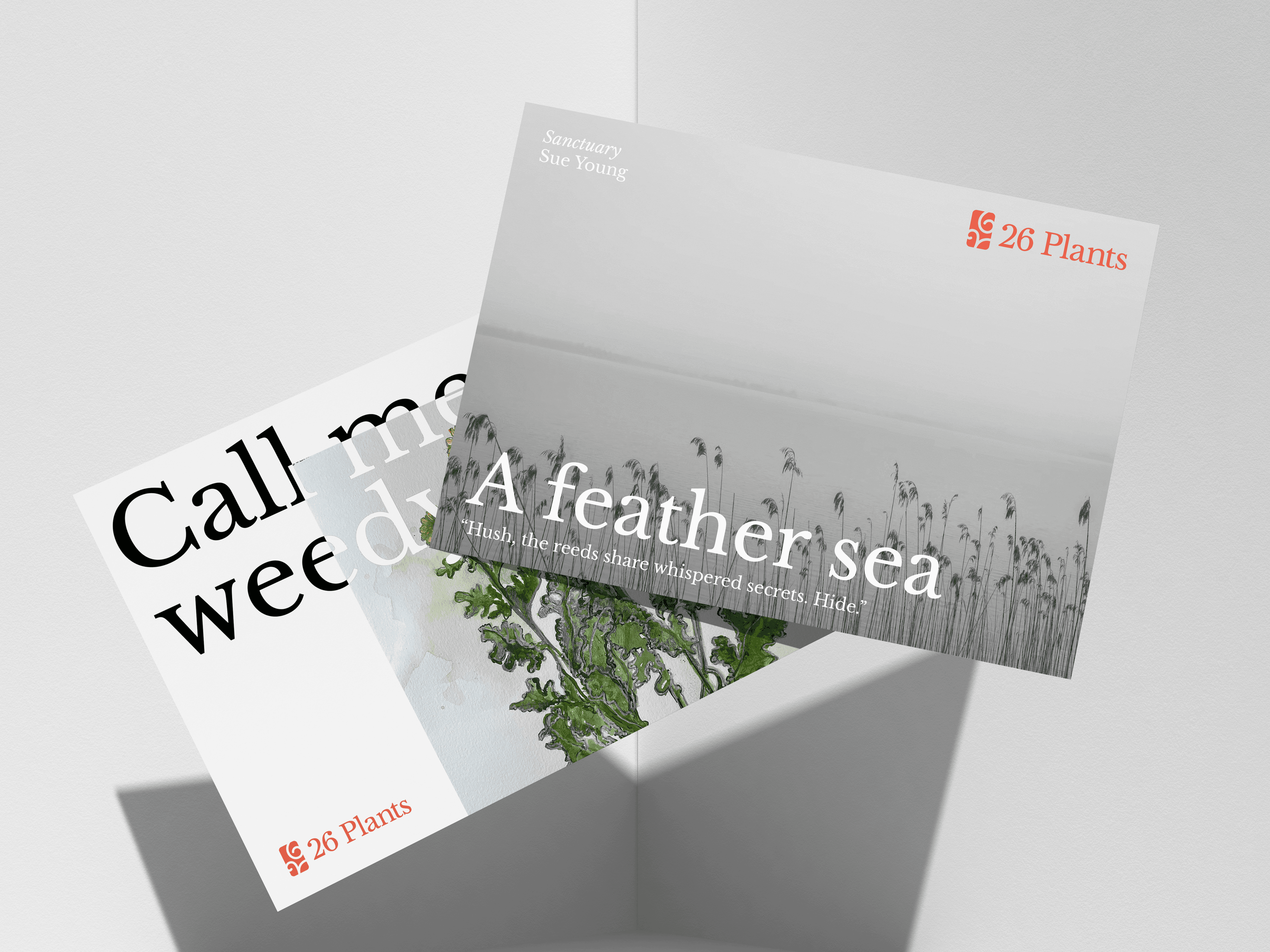
26 Plants
Sub-brand identity for the 2023 launch of 26's Wordstock event, in collaboration with The Wildlife Trust and Bloomsbury Festival.
Collaborators:
Social media rollout: Morris Chan
Illustrations: 26 (Mr. John Simmons, et al.)